I have started messing around with Windows 8 Consumer Preview recently. I installed it on a VM using Virtual Box. Its quite straight forward, and it worked quite well in a VM. It can be unstable to start with, needing a few restarts to boot, but once booted, its quite stable, and it works well.
The question to me is, is it worth upgrading? As it stands, I don’t think so. I am not going to upgrade because to me it seems more like a stripped down version of Windows. There are severe limitations when using the desktop version, and all the apps don’t really add any value. It just seems to limit the functionality. I can’t imagine any business upgrading to Windows 8, considering that Windows 7 is so stable, reliable, and easy to use.
Lets look at pictures to tell the rest of the story. Click for a larger picture.
The full album can be accessed here:
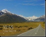 You are greeted with the lock screen at the beginning. There is something to be said about this screen. You hit Ctrl + Alt + Del to go the password screen, or click and the drag the screen upwards, to reveal the password screen. I thought that was a nice touch. This works for both the desktop and the tablet. I wish the rest of the interface was just as thoughtful. I also the like the look of the lock screen. This is a very pointless improvement that adds nothing but aesthetics.
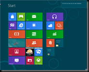 Once you get past the lock screen, you are greeted with the Start Screen. Everything is in large and colorful. Great for a tablet, but completely useless for a desktop. I can’t imagine what this would add in terms of functionality. Why would a user want to leave the desktop, go to a different screen and launch an app, instead of accessing it from the desktop environment, so that it is possible to multi task?
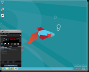 Clicking on the desktop will take us to the familiar desktop, with one big difference – no start menu. The familiar orb is now missing. It becomes a pain to navigate and launch programs. The Metro interface itself doesn’t bother me, it’s the fact that they removed the start menu is what really irritates me. Windows XP let users change the start menu to look like the Windows 98 classic start menu. No such luck this time. Without using 3rd party tools, it seems as if the users are stuck with the Start Screen. It seemed more like a prank than a needed UI redesign.
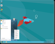 Using a program called ViStart. This looks very similar to the Windows 7 start menu, and the search function works, and also it is possible to access the power off functions from this menu. Quite convenient, but the start menu has some problems while launching certain programs. I am sure it will be fixed in the later versions, but Windows should really bring the start menu back!
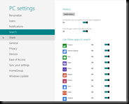 All the options are now sliders. There are no radio buttons and checkboxes anymore. It seems as if all the screens are designed for the tablet. I don’t have a problem with this in particular. Its when features are stripped out in favor of a tablet like experience, it starts to become pointless for a desktop or a laptop. The redesign adds no value to a regular user. One of the many redesigns that don’t make a lot of sense. They are trying to fix things that aren’t broken.
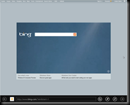 This is the IE metro app. Again, I thought this was not adding much value. Even novice users now either use Firefox or Chrome. I know for a fact that my mom, who cant launch a browser unless there is a shortcut on the desktop, uses Firefox because she figured out she didn’t like IE. That being the case, why would I ever use an IE app? Especially when I am restricted, and I can’t effectively switch between tasks on a desktop? I guess it won’t hurt to have it, but if I were to ever upgrade to Windows 8, I don’t see myself using this at all.
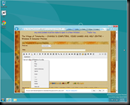 It only took 3 versions for IE to get a spell checker! I am sure the backend is much improved with support for new technologies and such, but the front end is disappointingly the same. I don’t know if the browser will get extensions like Firefox and Chrome, but out of the box, its almost like IE 9. It’s a very underwhelming experience. This again highlights why the IE metro app is so pointless to me. I am using Chrome anyway, and even a Chrome metro app would be of no use to me. I should also mention that there is no Paste & Go option either. That is such a simple addition, which should been included! Very lame.
 This is the Remote Desktop app. Although it is possible to launch remote desktop through the classic desktop, using the app is very limiting as expected. At work, I have 2-3 remote desktop windows open at a time, while I am using my regular desktop applications. So again, on the desktop version, I fail to see any need for this app.
Overall, Windows 8 has not been the change I was expecting to see. I am hoping the final release version would be better in terms of offering users the choice between using the Metro Start Screen and the Windows 7 start menu. Of course, there is also the possibility that the metro interface is going to be a huge hit among consumers, and one day will be look back at the time when we complained about it. Only time will tell.
No comments:
Post a Comment
Had to include word verification to prevent spam.